Intermediate HTML and CSS
Class 4
Welcome!
Girl Develop It is here to provide affordable and accessible programs to learn software through mentorship and hands-on instruction.
Some "rules"
- We are here for you!
- Every question is important
- Help each other
- Have fun
Mobile Web
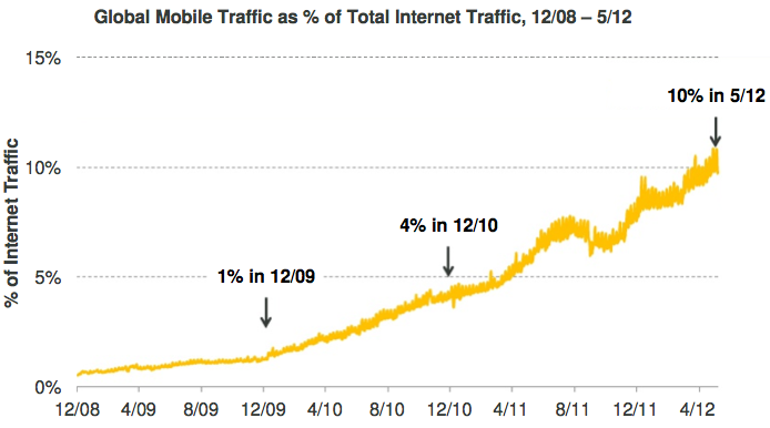
The mobile web is (really) big.
Mobile Web
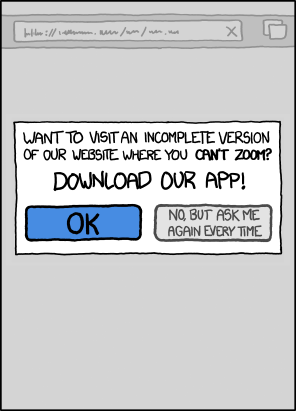
Solutions?
- Ignore the problem. Site is unusable for mobile users.
- Separate mobile site. Twice the development & maintenance.
Responsive Design
Rather than tailoring disconnected designs to each of an ever-increasing number of web devices, we can treat them as facets of the same experience.
Ethan Marcotte, "Responsive Web Design"
Responsive Design
Design by thinking of the structure of your website, and how different elements fit into the structure.
Responsive Design
Desktop View

Responsive Design
Tablet View

Responsive Design
Mobile View

Responsive Design
Examples:
Responsive Design
Fluid Grids
- Fixed layout elements (like
div.sidebar {width: 320px;}) prevent resizing content for different browsers. - Use relative units
emor%to allow flexibility.
div.sidebar {width: 30%;} - Use
max-widthormin-widthto add limits where needed. - Don't forget height!
Responsive Design
Flexible Images
- Default: Images are displayed at full size
img {width: 600px}makes all images exactly 600px wideimg {max-width: 600px}makes all images no more than 600pximg {max-width: 100%}makes images fit inside their containers
Responsive Design
"viewport" meta tag
<meta name="viewport" content="width=device-width, minimum-scale=1.0, maximum-scale=1.0">Tells mobile browsers to use the actual size of the device instead of emulating a desktop browser.
Media Queries
- Conditional style sheets
- Changing specific CSS styles on different browsers based on width, device-pixel-ratio, and orientation
- Called via viewport meta tag
Media Queries
A media type and at least one expression that limits the style sheets' scope by using media features, such as width, height, and color
Media Queries
background-color: grey;
@media screen and (min-width: 300px) and (max-width: 600px)
{
background-color: red;
}
@media screen and (min-width: 900px) and (max-width: 1200px)
{
background-color: blue;
}
<meta name="viewport" content="width=device-width, minimum-scale=1.0, maximum-scale=1.0">Media Queries
Frequently used in responsive web design
Responsive Design and Media Queries
Most of our styling will stay the same
Colors, padding, etc.
Only change what needs to for each view
Responsive Design and Media Queries
Tablet example
/** Tablet view **/
@media screen and (max-width: 960px){
  h1 {
    font-size: 1.1em;
    line-height: 40px;
  }
  header nav li{
    line-height: 40px;
  }
}
In tablet view, we don't need the header to be so big
Responsive Design and Media Queries
Mobile example
/** Mobile view **/
@media screen and (max-width: 480px){
  #famous article.woman {
    float: none;
    margin: 5px auto;
    padding: 2%;
    width: 80%
  }
}
In mobile view, we don't want the bios to float
Let's Develop It
Enhance our Women in Computing web site to use HTML5 & CSS3
Let's Develop It
- Use media queries to make our site responsive
- Start small
- You will have a little bit more time than normal
- Useful tutorial CSS3 and Media Queries
- Useful tutorial Responsive Design in 3 Easy Steps
Tools & Deployment
Remember that HTML5 is still new
That means we have to be aware of what each browser can do
And make sure that people don't lose functionality
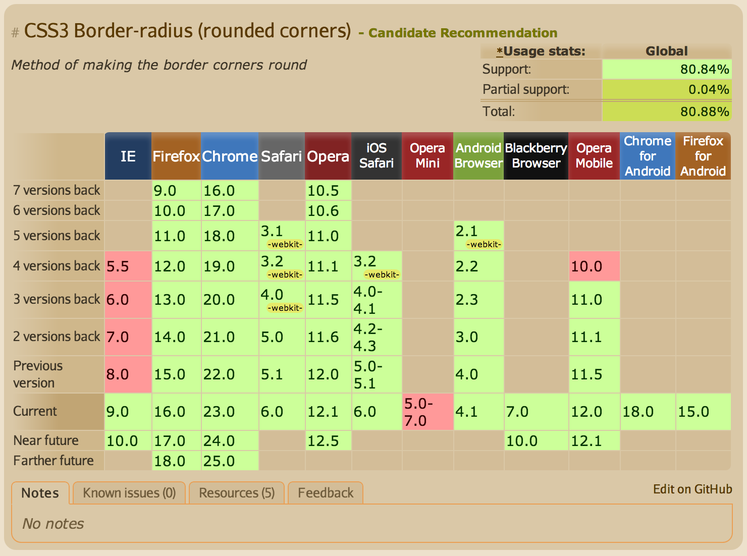
Can I Use?
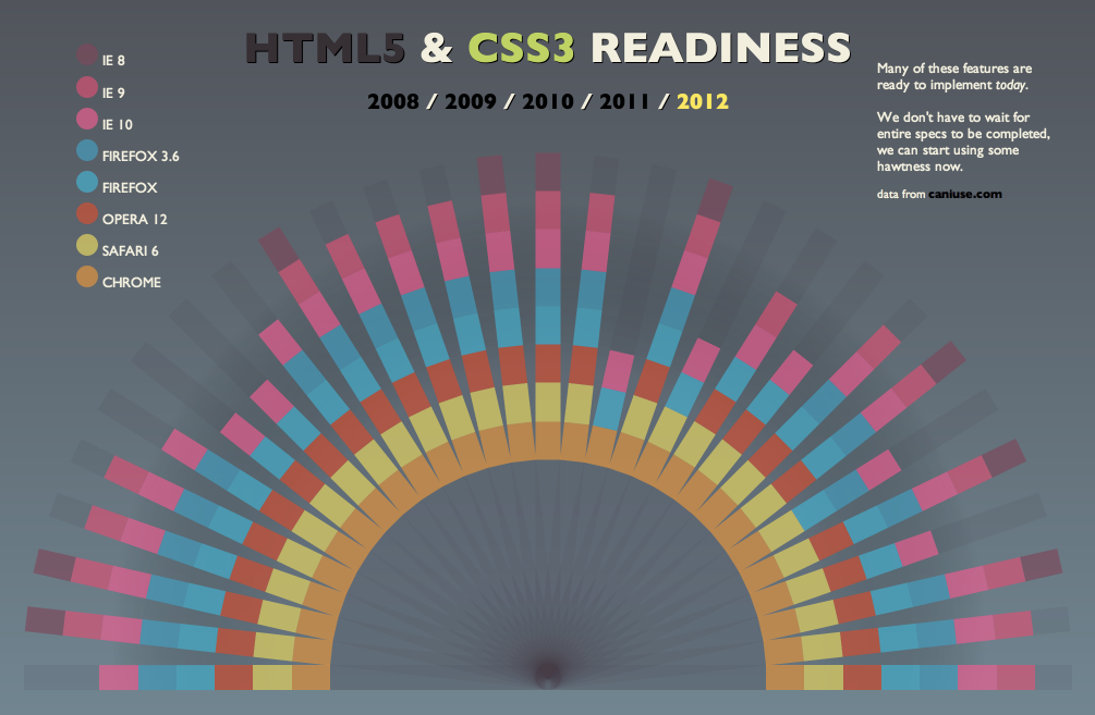
HTML5 & CSS3 Readiness
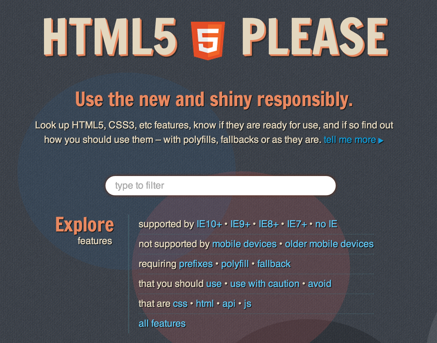
HTML5 Please


HTML5Shiv
HTML5 IE enabling script
- JavaScript library that detects HTML5 and CSS3 features in the user’s browser
- Works well with polyfills - a piece of code (or plugin) that provides the technology that you, the developer, expect the browser to provide natively
- A lot of the code is in JavaScript, but you can look here for how Modernizr helps with CSS

- Boilerplate to help you get started
-
Includes:
- jQuery
- Modernizr

- HTML5 templates generator to help you get started with a new project based on HTML5 Boilerplate
- It generates for you a clean customizable template with just what you need to start!
Let's Develop It
- Look through the HTML5 tools in the previous section and try to update our site to work with older browsers
-
Stuck or want something new?
- Use Initializr to create your own blank template
- Look at the structure of the HTML and CSS to learn new ways of building a site structure
- Use all your knowledge from the past classes to begin building something uniquely yours!